Tuesday, December 1, 2015

Paulownia II

Paulownia II
8" x 10" Oil on board
Not for sale

Today is not the day to write about the fact that I'll never visit or paint the river again; that'll happen when the time is right - possibly when I post my final river painting. I was fortunate to spend several beautiful weekends at the river this summer and this was one such weekend in mid September.  I didn't quite capture the warmth of this scene as I had hoped, but I like the way it turned out.  I also learned through trying to remember the name of the tree on the left that the Japanese used to plant Paulownia trees when a baby girl was born. When the girl married, the tree was turned into a dresser and given to her as a wedding present. If I owned the river property and the Paulownia trees that line the road leading in to the house, I would certainly build Camlin, who first visited the river when she was two months old, a dresser.

Paulownia Tree

Paulownia Tree
5" x 7" oil on board
Sold

This is looking across the field from below one of the Paulownia trees that line the road leading to the river house. I had a bunch of paint left over after completing an 8" x 10" painting of the same scene, so I did a quick palette knife painting.  I was leaving the next morning and didn't want the paint to go to waste.  My camera oversaturated the colors, as usual.

Apples with Cerulean Cup

Apples with Cerulean Cup
5" x 7" oil on board


Like a lot of my recent paintings, I painted this one quickly while Camlin was taking nap; sort of like how I'm writing this blog post...I guess it's good practice to get your thoughts down quickly.  Or maybe it's a shame that we have to cram everything into its own little window, even creative opportunities.

Last Rose


Last Rose
5" x 7" oil on board
Sold

There was one sad little rose left on the bush in front of our house last week.  It was supposed to freeze that night, so I plucked it and put it in a jar in the kitchen window.  Then I had to paint it.  Since completing the painting, the rose opened up and became even more beautiful.  Sadly, I haven't had time to paint it again.  I'm happy with this one, though.

Sunday, August 30, 2015

Cantaloupe II

Cantaloupe II
5" x 7" oil on board
Sold

I had a lot of paint left over after I did finished the 8" x 10" (previous post), so I did this little one really quickly.  I like it.  The best thing about these paintings is the details that I left out.  For example, the plants on my patio and in my kitchen.

Cantaloupe I

Cantaloupe I
8" x 10" oil on board


From this painting, I learned how to spell cantaloupe.

Window Peaches

Window Peaches
8" x 10" oil on board


Some peaches in manganese violette, viridian, and cadmium yellow light.

Monocacy River Train Bridge

Monocacy River Train Bridge
8" x 10" oil on board
$70 plus shipping

Sadly, I am writing this post on the final day of summer vacation before I return to teaching and the stress of the school year. Summer photos have been uploaded and now it's time to scroll, achingly back through the wonderful experiences that I shared this summer and reassure myself that good times will return.

This painting is a reminder of one such experience. I was allowed out of the house for a day of fishing and painting, so I chose the Monocacy River, never having fished it before.  The Monocacy is beautiful and filled with fish.  I paddled upriver for a mile or so, casting along the way and catching tons of decent sized smallmouth bass. Once prime fishing hours had passed, I set up my easel in front of this train bridge and did my best. Amtrak passenger trains rumbled by occasionally as I painted, and when I was finished, I took a swim.

Thursday, August 20, 2015

Crabtree Falls Trail

Crabtree Falls Trail
8" x 10" oil on board


My wife and I hiked Crabtree Falls trail the final morning of our wedding anniversary weekend in the mountains south of Charlottesville. It's a beautiful hike and it's popular, especially in October, so you have to get there early to avoid the crowds.

I went with manganese violet, viridian green, and yellow for this one. The sun was just coming up over the ridge in front of us, and I tried to capture the differences in color temperature from foreground to background and left to right.

Green Apple

Green Apple
6" x 6" oil on board
$40 plus shipping
Getting bored of the blue, red, yellow color scheme, so I'm trying out some new ones.  I think I used dioxazine purple, viridian green, and cadmium yellow light for this one.  I think.

Thursday, July 30, 2015

Rose of Sharon

Rose of Sharon
8" x 10" oil on board
Sold

Fedor Zakharov might be my new favorite painter. Of course that distinction changes from week to week. But what strikes me most about Zakharov and the Russian impressionists, aside from vibrant color schemes, super thick paint and brushstrokes, is the confidence that it takes to paint the way they do. It takes a lot of confidence to put down a stroke and leave it, knowing that while it may look out of place at the moment, you will bring it all together in the end.

I'm not comparing myself to Fedor Zakharov, but I think this painting and some of my recent work is a step in the right direction.  I'm starting to do more than just replicate what I see in front of me. I'm making decisions about value and tone, color scheme and temperature that go beyond recreating what I see. I can see a little more confidence when I look at this painting.

Wednesday, July 29, 2015

High Noon on the Patio - Forest Edge

High Noon on the Patio - Forest Edge

5" x 7" oil on gesso board


My camera had a hard time with this photo, distorting values and colors as usual...Either way, this is an interesting little painting.  I used a palette of quinacridone purple, cadmium orange, and viridian green because when I sat in my lawn chair, eating lunch and thinking about this painting the day before, that's what I saw. I took a photo and did my best to premix values before I went outside because I knew the light would change quickly. I painted this between 12 and 1pm. The color combination made it tough to match the variety of colors, especially the greens, but I think it worked and it was more about the values anyway. The round thing in the lower left quadrant is a soccer ball that my dog, Riley, has been slowly chewing through the last two years.  That's her water dish just above the ball. I really like the greenish shadow on the flower pot in front and the mid value orange on the ball.  The chair is actually black, and I could have made it nearly back, but I felt like that would distract from the ball and the flower pot.

Tuesday, July 21, 2015

Springtime on the Piankatank

Springtime on the Piankatank
8" x 16" oil on board
Not for sale

I painted this to hang over Camlin's crib (if it ever arrives).  Interestingly, I painted this over another painting that I didn't love and had never posted. I like working over paintings because you wind up with nice textures and you can let some of the original painting peek through, providing spots of color to break things up.

Counter-y Things

Counter-y Things
16" x 20" oil on board


My brain's a little fried at the moment from lack of sleep, so if you can think of a better name for this painting, I'm open to suggestions. This was one of those times when I was drawn in by an arrangement of objects that just had to be painted. All objects except for the cactus in the top left were positioned as they appear in the painting.  I felt like I needed another mass up there to balance things out, so I grabbed a cactus and went to work. I like the looseness of this painting.

Yellow Tomato with Glass

Yellow Tomato with Glass
5" x 7" oil on board


As usual, I had a hard time getting a good photo, but I really like the color scheme and simplicity of this one.

Mango

Mango
5" x 7" oil on board


My camera may have over-saturated the colors a bit, but this is close. Lately, I've been working exclusively with ultramarine blue, cadmium yellow light, and cadmium red light just to simplify things.  However, I couldn't make the green that I needed for the mango with those colors, so I added viridian for this one.  I attempted to paint this mango one stroke at a time and then leave it.

Has Been

Has Been
5" x 7" Oil on board


I'm managing to squeeze in some quick paintings between screams.  This one is really simple, but I like it.

Tuesday, June 23, 2015

Pink Ladies

Pink Ladies
5" x 7" oil on board
Sold

I alternate between loving my paintings and hating them. How did painting become my passion? I'm not even sure. I don't have anything new to say or innovative to offer, so why do I do it? I wonder if I should focus my energy on something worthwhile like being a good dad or a better teacher?

I painted this on one of the many days sprinkled throughout the year that remind me of death and the brevity of life. In this case, the anniversary of my dad's death, which sometimes coincides with Mother's Day, reminding me of my mom's death.  But instead of cracking a beer and sitting on the couch in the dark, I painted.  And I thought about life.

Globes

Globes
5" x 7" oil on board


This is one that I nearly scrapped, not even halfway through painting. Quite often during the course of making a painting I find myself doubting or even hating what I've done. But, time and again, I've reached those points of despair, and I've found that if I work through them or even around them, focussing on something else for a while, they work themselves out. Often, the paintings that frustrate me the most in the beginning turn out to be the best paintings. And sometimes they're just terrible from start to finish...I think this one worked out ok though.

Black & Decker

Black & Decker
8" x 10" oil on board


This is my dad's old Black & Decker drill. I inherited most of his vast tool collection after he died, including things like furniture clamps, jig saws, hand saws for dove tailing, and other tools I'm not even sure what to do with. My brother inherited my dad's ability to use them effectively, but he was already in good supply of tools.

My dad's artistic outlet was his carpentry and metal working. Before the time of the internet and downloadable plans, he had an amazing ability to create furniture and even machines out of wood and scrap metal by just drawing them out or seeing a piece in a store or on TV and recreating from memory. I'm not positive that the Bowflex had even been invented when he fabricated his first home gym with bench press, lat pull down, row station, and even his own plate weights, cut out of scrap metal and linked together with cables, pulleys, and bearings.  It was pretty incredible.  I, on the other hand, experience the rage when I have to do something as simple as installing blinds in my baby's nursery.

Monday, June 22, 2015

Evening in Zion

Evening in Zion
5" x 7" oil on board
Sold

This is an image of Zion Canyon from our tour of Utah's national parks. I can't wait to take our daughter there when she's old enough. Pretty good light in this one.

Hunter

Hunter
8" x 10" oil on board
Commissioned - Sold


Despite the tiny, grainy photo that I referenced for this painting, hacked from Hunter's owner's Facebook page, I think I was able to breath some life and some meaning into this work. The respect and admiration that I have for Hunter's owner entered into every decision I made with this painting, even down to the colors I chose.  Thanks for being such a great teacher.

Sunday, June 21, 2015

The Shed

The Shed
8" x 10" oil on board
Sold

My sister described my painting as "sloppy."  One of many qualities that my sister and I share is that things don't always come out of our mouths the way we intend them to. At least I hope that was true in this case.  She went on to clarify that it was, "sloppy in a good way."  Still not exactly the description one wants to hear about ones painting style, but I think I know what she means.  These days, I'm really focussing on clean, bright colors and correct values, possibly at the expense of technique. Painting outside forces you to make decisions about color and value quickly. It's great practice, and hopefully as I am able to make those decisions more quickly and accurately, some of the "sloppiness" will fade and I'll be able to focus more on technique.

One decision I made with this painting that I think represents a step in the right direction was to stop looking at the scene in front of me after about an hour of painting. The light had changed so much that I found myself reworking things that didn't need reworking. I focussed on working within the values that I set out initially, and I think I was successful. I usually don't say this, but I love this painting.  When I look at it, it makes me feel the way I do midday at the river when I'm engulfed by warmth, humidity, good smells, and the anticipation of good times with family and friends. Plus, I got to paint with my sister.

The Porch

The Porch
5" x 7" oil on board


I had a lot of extra paint left on my palette after painting the sunrise, so I turned around and painted the porch.   The sun was partially obscured by some clouds, and it created a nice little glow. The light was changing so fast that I only had time to get down the basics. It's incredibly simple, but I like it, maybe because it's not over-worked or over-thought.

Remnants

Remnants
5" x 7" oil on board


When I was a kid, there was a dark and dense tangle of vines and trees separating the river house property from the property just up river to the north.  There was one path, tunneling through the darkness to a sand road that wound through corn fields, growing all the way to where the bank angled down to the river.  The path through the woods was sandy but strewn with holly leaves.  Always barefoot, I chased many a ball and frisbee into those prickly woods.  Usually, my brother and I would fight over who had to go in after.

Now, there's a mansion hovering over our cinderblock shack, and the woods, once home to foxes, raccoons, and all manner of tiny animal, have been thinned to make visible some of the larger oaks and sycamore trees. The trees are ancient and beautiful, but it also makes our neighbor's house much more visible.

This painting is what's left of the woods between the properties.  The corn fields have transitioned to alfalfa; that's the golden streak you see running through the middle of the painting.


Piankatank Sunrise

Piankatank Sunrise
5" x 7" oil on board


The mattress in my room at the river house is probably as old as the house. It's like sleeping in a creaky hammock with springs poking you on either side.  As usual, I couldn't sleep, so I decided to catch the sunrise. All in all, this took about 10 minutes to make. Hopefully, that's obvious in a good way, not a sloppy, ugly way. If you look closely, you can see a gnat flying into the heart of the sun.

Clothesline


Clothesline
8" x 10" oil on board
$70 plus shipping

This was the last of my Memorial Day river house paintings, painted the morning of my final day; the specter of packing and Memorial Day traffic with no air conditioner haunted this painting.


Violette's Lock

Violette's Lock
5" x 7" oil on board
Sold

I took a personal day last Wednesday, June 17th, even though it was a week before summer break because...well, because I felt like I deserved a day after SOL's, SOL remediation, and SOL retakes.  Plus,  it might have been the last chance I'll have to take the kayak out, or paint, before our baby is born.

This was an ambitious little adventure. I decided I would fish for a few hours after sunrise and then paint once the fishing slowed down. So I packed an oversized dry bag with my travel easel and painting supplies, thinking it would fit in the hold of my kayak. It didn't, so I strapped it to the back of the kayak and paddled off into the dark at Violette's Lock on the Maryland side of the Potomac River, a few miles west of Potomac, MD. Normally, the rapids around Violette's Lock are nothing to fear, but I realized as I put in that the river was up a bit.  The biggest rapid that you have to navigate at Violette's Lock is in the narrow inlet, immediately after you put in. There's a sizable drop located on a sharp bend and in the dark with the water up, it's a little scary. However, I made it through, and I caught some nice smallmouth along the broken down dam that stretches across the river next to the lock. This is an ideal fishing/paddling trip for lone paddlers because it doesn't require a shuttle.  You float down a mile and a half or so, hop over to the C&O Canal and paddle back to the starting point.

Painting was a little more difficult. As I daydreamed about my fishing/painting adventure during my off-periods leading up to my day off, everything was so much easier.  Idyllic scenes abounded, the ground was flat, and my paintings were fresh and beautiful.  As usual, reality did not match my delusions.  In fact, I dropped my painting completely under water twice!  How it arrived home not completely ruined is a miracle. And if you plan to purchase, beware that there may be some specs of Potomac River sediment embedded in the paint. Character...


Sunday, April 12, 2015

Philodendron Over Alaska

Philodendron Over Alaska
16" x 20" oil on board
Sold

This is an interesting painting. It's called Philodendron Over Alaska because it's painted directly over a painting I had started from a photo reference from my wife's trip to Alaska.  I just couldn't get the original painting to work, and it bothered me that I had wasted a perfectly good 16" x 20" board, which is larger than I usually paint.

I'm not sure what possessed me to paint over Alaska without sanding it down or attempting to wipe it away, but the result is kind of cool.  Because I used thick brushstrokes in the underpainting, there are lots of interesting textures throughout the still life.  It almost looks like it was painted on plywood.  And because I used the same palette to mix the underpainting, I was able to let it poke through in places.  For example, the red and lavender of the chair is all underpainting with the wall blocked in to form the shape.  In reality, the chair is black, but I thought the red underpainting complimented the vase and added to the harmony of the painting.  I used the same effect in parts of the philodendron where you can see red and lavender poking through.

Saturday, February 28, 2015

Kanlica Village

Kanlica Village
5" x 7" oil on board
Sold

I could not get a good photo of this painting to save my life. That aside, I really like the painting. The village of Kanlica is one of the stops along the Bosphorus Strait ferry tour my wife and I took last year when we visited Istanbul, Turkey. The Bosphorus Strait runs between the Black Sea and the Marmara Sea and separates Europe from Asia.  So, even though I only spent a brief time in Asia, I can say I have at least stepped foot on the Asian continent. One of these days, I hope to spend some more time there.

The Bosphorus tour was amazing.  The final stop was the village of A. Kavagi, where the Bosphorus empties into the Black Sea. Yoros Castle, built in the 15th century, overlooks the Black Sea on a hill rising behind A. Kavagi.  The tour gave us enough time to explore the village on our own and climb to the top of the hill to explore the castle.

We stopped at a little fish restaurant on the way down the hill and ate whole grilled fish and drank Efes, Turkey's most widely distributed beer. Everything was so beautiful, we could not put our cameras down. Any time I'm touring a new city that has any kind of waterfront, I make a point to see the city by water. I always see sights that would have been impossible to see otherwise.

Tuesday, February 17, 2015

Got One?

Got One?
5" x 7" oil on board
Sold

I've been trying to paint outdoors as much as possible lately, but the last couple of weeks have been ridiculously cold.  This image is from our trip out west a few years back.  The scene is Echo Lake near the base of Mt. Evans, outside of Denver, Co.

Strange Path II

Strange Path II
8 &1/2" x 11" watercolor on paper


Last Sunday, Sarah said she was bored so I convinced her to do some watercolor painting with me.  Getting started, I didn't have the most serious of intentions.  I was going to give Sarah some pointers and have a beer or two while painting leisurely. However, I wound up really liking the painting.

Sarah's painting turned out nicely as well.  Here are the suggestions I gave her:

1. Draw out the scene very lightly before starting.
2. Use only three colors to keep things simple:  red, blue, and yellow.
3. Paint in shadow areas first.
4. Move colors around. Don't limit a color to one spot.

Here it is:

Top O' the Dryer

Top O' the Dryer
8" x 10" oil on board
$70 plus shipping

All I can say is sometimes I want to paint a still-life subject, but when I try to arrange the still-life it looks "arranged," and I don't like it at all. So every now and then I'll see something, similar to the way I saw the hammer and nail sets on my desk (see previous post), and I have to paint it because it's arranged in a perfectly un-arranged way.  With this one, I loved the way the dryer sheets were positioned perfectly, from a compositional and complementary standpoint, next to the blue bucket and green shirt.  Yeah, kinda weird.

Hammer and Nail Sets

Hammer and Nail Sets
5" x 7" oil on board


A piece of my travel easel popped off, so I had to put a tiny nail in it to keep the paint tray from sliding out and spilling all of my supplies. I left my hammer and nail sets sitting on my desk, and one day, as I walked past, I realized that I liked the way they were arranged. They were actually sitting on a blue towel that was covering my desk at the time. I used ivory black, red, and yellow ochre, so I wasn't able to make a true blue. The result looks a bit like plywood or something you'd find on a worksite.

Sunday, February 1, 2015

February 1st

February 1st
8" x 10" oil on board


February 1st. Quite possibly the worst day of the year. Not only is February 1st the dregs of winter, my least favorite time of year, but it's also the day my mom passed away, 18 years ago.

I have tried not use my mom's death as a reason to hold back from enjoying the good things in my life. However, not a day goes by that my mom or her death doesn't cross my mind in some form. And although I've tried not to let if affect me negatively, I know that her death, and the chain of events that followed, have forever changed my life and my view of the world; in many ways for the better.

Because of my mom's death and my dad's a few years later, I spent a lot of time thinking about the point of life and what was really important and worthwhile.  I ruled a lot of things out; an obsession with staying busy, relentlessly staring at screens, blind consumerism and inactivity. Many people seem to think these things are the point of life. Ultimately, it was my mom who helped me find the truth.

An excerpt from a journal that she wrote as she was dying is framed by my bedside, and I read it often. My favorite line is this: "Every day of life has something good and valuable in it. Sometimes you have to look hard to find it, but it's there." This line may have been what spawned my love of painting, and my obsession with trying to see the beauty in life. I don't always succeed in finding it, and I often lose my way, but I've been able to return to this, and I've been happier for it.

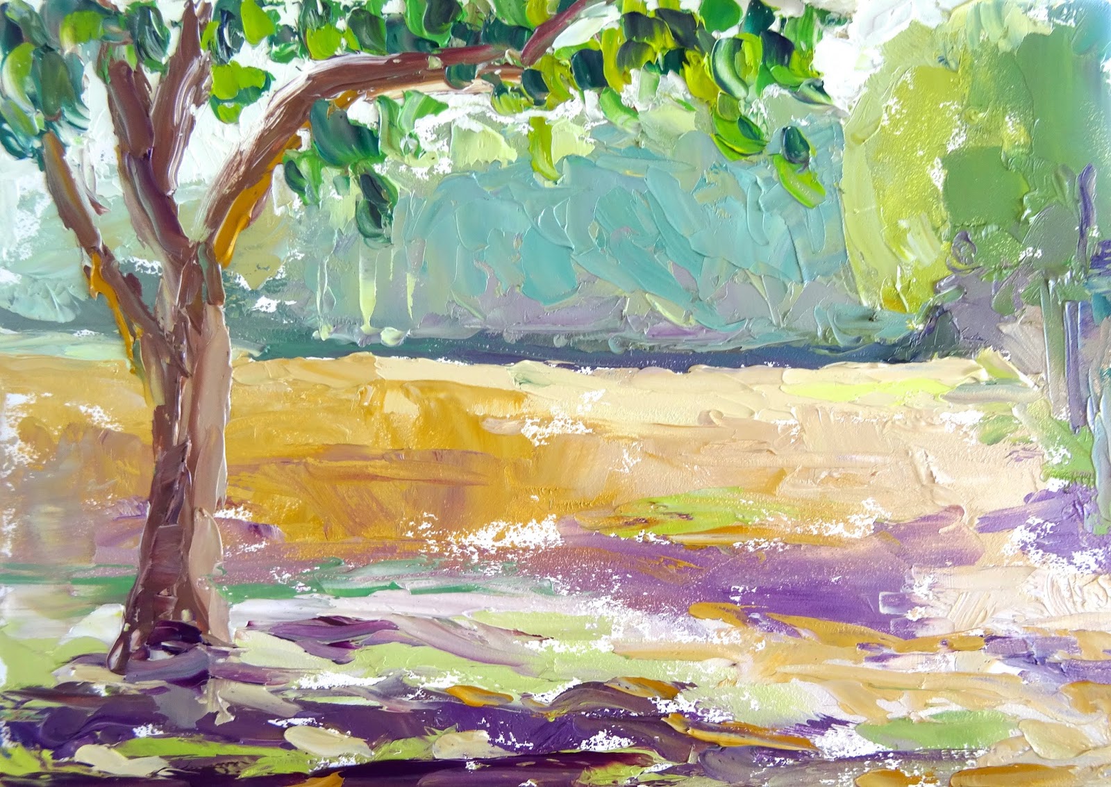
With that in mind, I attempted to honor my mom today by braving the extreme cold and painting outside. Man was it cold. I think I may have been close to hypothermia. The wind blew harder and harder off the frozen lake as I painted. And, although the painting is pretty true to the colors and values of this cold, dreary day by Lake Fairfax, I'm not sure I captured the beauty of the scene. But at least I tried.


Saturday, January 17, 2015

Cart Path

Cart Path
8" x 10" oil on board
$70 plus shipping

I registered for a "plein air workshop" this Saturday at Art Frame Solutions, which backs up to Reston National Golf Course, the location for this painting.  I think this is the twelfth hole. Turns out, I was the only one registered, or maybe I was the only one stupid enough to stand outside in the freezing weather to paint.  It was chilly to say the least.  There weren't a lot of options for subjects, and there were a few people who apparantly like playing golf as much as I like painting, so I chose these two bushes.  They were the most interesting subjects and this was the location least likely to lead to death by golf ball. It was so cold that my paint literally froze.  It was like wiping play dough on the board, and I forgot to bring any linseed oil or medium that might have loosened it up.  Still, I like the way it turned out.  I tend to overwork my paintings, and maybe because it was so cold, I spent as little time working it as possible.  The photo makes the color temperature appear a little warmer than it appears in person.

Autumn Begins


Autumn Begins
Oil on two, 8" x 8" cradled hardboard panels
$175 plus shipping

I should have taken a profile picture to show the edges of the hardboard panels.  They are 3/4" deep with finished edges, so you don't even have to frame these if you don't want to.  They look really nice. It was such a pain in the ass to arrange these side by side in the blog editor that I was afraid to add another photo.  

The location is the George Washington National Forest right on the border or possibly in West Virginia - the Tibbet Knob hike.  This was a tough subject, but I like the way it turned out and, as usual, they look better in person.  

Here's a closeup of the brushwork:


Sunday, January 11, 2015

Midmorning in Forest Edge

Midmorning in Forest Edge
5: x 7" oil on board


The second of my power outage paintings.  Did I mention that it was 6 degrees outside?  I started this one around 10:30am, and it got a little cold inside by the time I was finished.  This one is a little cleaner than the first because I had a lot of my colors mixed after the first painting, which freed me up to focus on my technique.

Morning in Forest Edge

Morning in Forest Edge
5" x 7" oil on board


We had a snow day on Wednesday, and the power was out all day.  I had nothing else to do; even the battery in my Kindle was dead.  So I sat by the back window and painted.  The light was changing quickly, so I had to paint fast, and I went with another limited palette of Prussian blue, cadmium red, yellow ochre, and white to keep things simple.  I started this one around 8:30am and fished around 10:30am.  Then I did another.

Thursday, January 1, 2015

Watering Can

Watering Can
6" x 8" oil on board

I experimented with my color palette again, and I really like the effect. The colors I used here were ivory black, yellow ochre, and cadmium red.  I feel like this palette creates a nice earthy look that goes well with the watering can.  The toughest part of this painting was the initial drawing of the can and getting the right proportions on the board.

I also experimented with my edges, attempting to direct the viewer's eye by softening certain lines, making others disappear altogether, and making some hard and clear.  The idea is to direct your eye to the hardest lines.  You might have to zoom in to see, but there's some cool stuff going on in this one.

Escapee

Escapee
8"x 10" oil on board
Sold

I've been experimenting with color palettes and values a lot lately, especially with the effect of limiting the darkest values in my paintings.  I feel like limiting the range of values to a higher key creates a pleasing, harmonious effect. However, my photo editing woes continue; in this case, the photo increases the contrasts and makes the darkest values look darker than they are in person. I did this with a palette knife using ultramarine blue, cadmium red light, and cadmium yellow light. I really like the way it turned out.